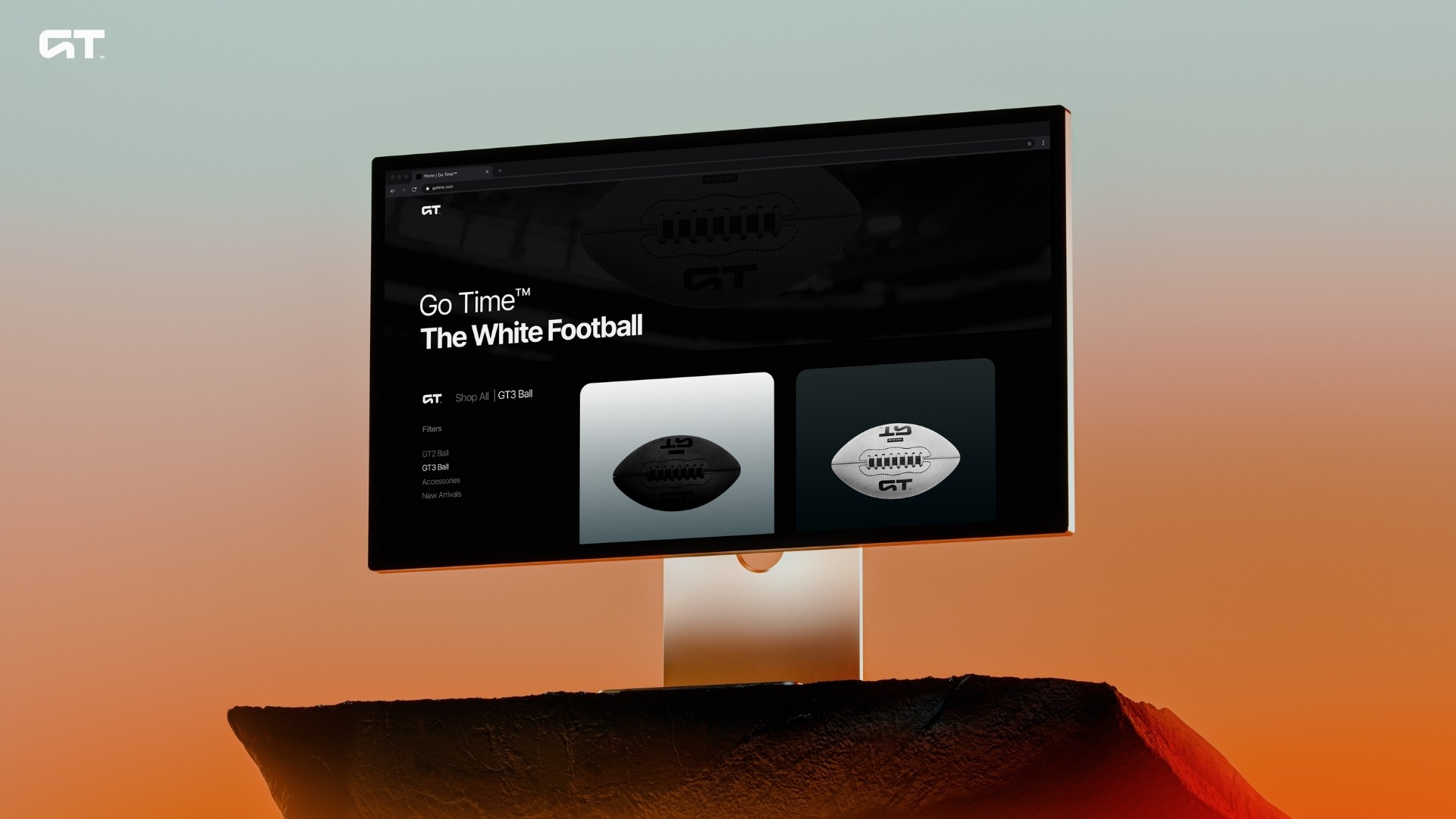
Go Time
Go Time
2025
2025
2025
2025
Brand
Brand
Brand
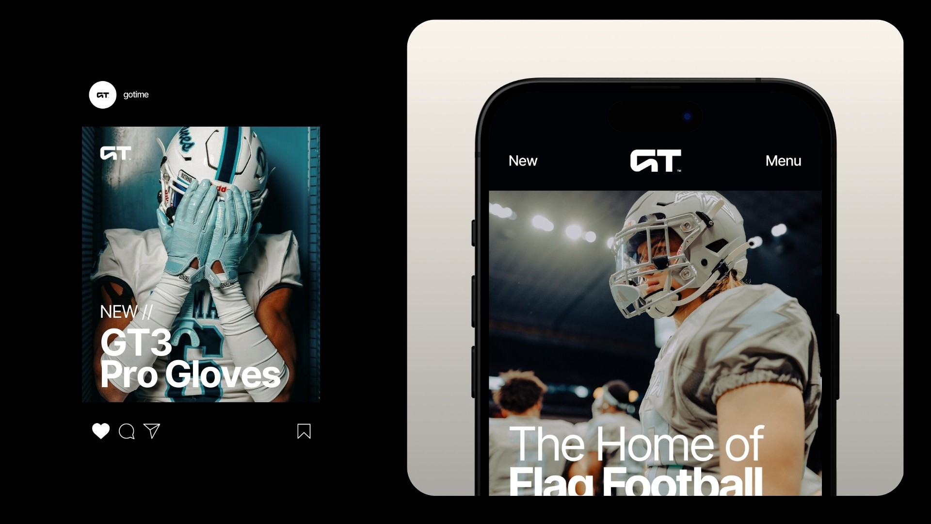
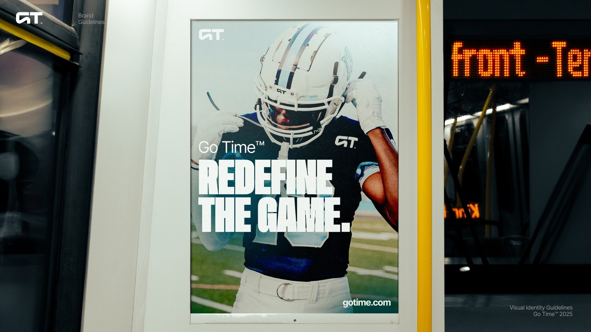
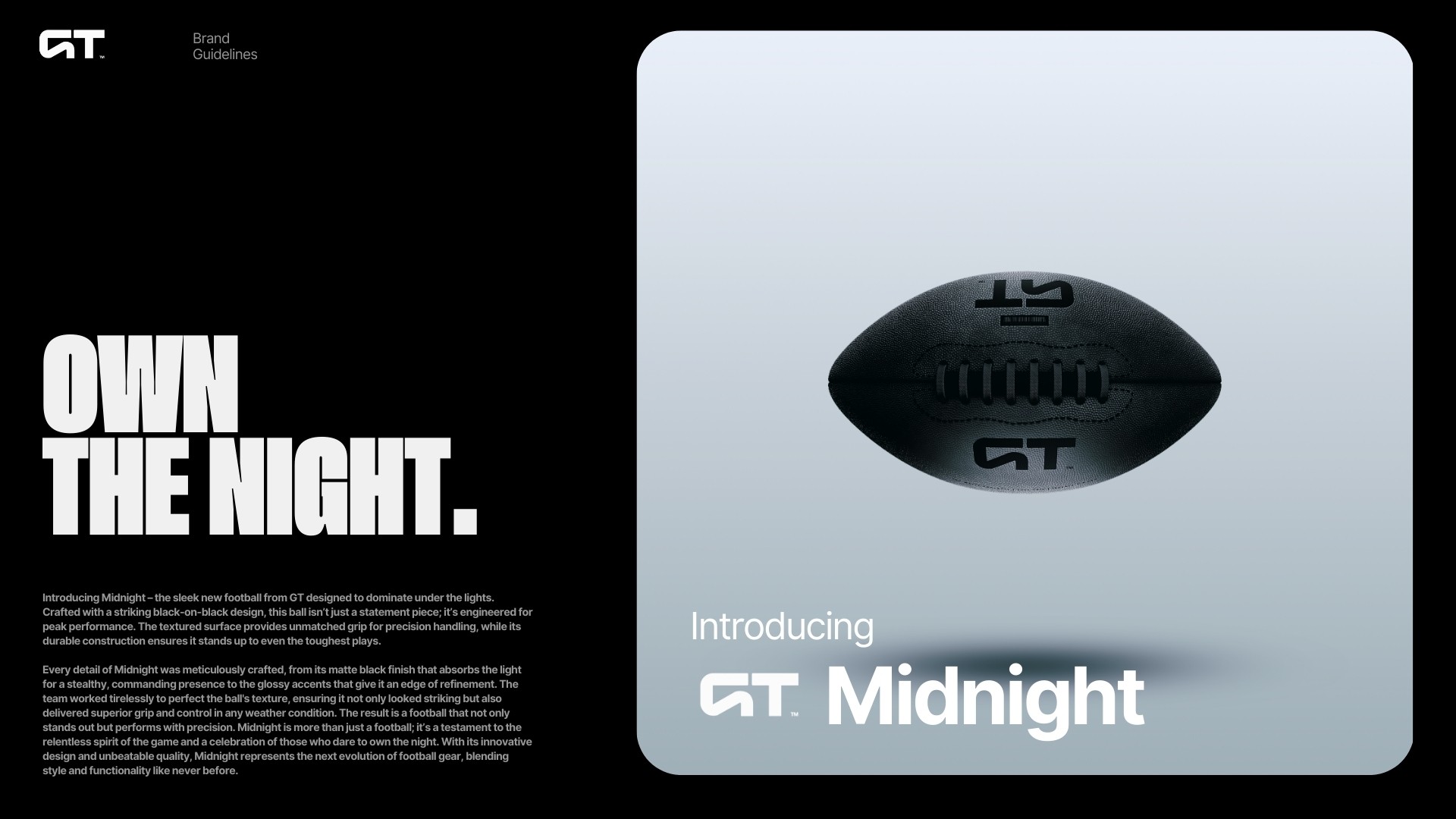
Behind The Brand
The goal was simple yet ambitious: to take Go Time and transform it into a top-tier, contemporary sports gear brand that redefines performance and style. By blending bold design with cutting-edge functionality, GT was born—a brand built for today’s athletes who demand more from their gear.
This rebranding elevates GT from just a name to a symbol of innovation and excellence, delivering sports gear that empowers players to dominate their game with confidence and style.
The goal was simple yet ambitious: to take Go Time and transform it into a top-tier, contemporary sports gear brand that redefines performance and style.
By blending bold design with cutting-edge functionality, GT was born—a brand built for today’s athletes who demand more from their gear.
This rebranding elevates GT from just a name to a symbol of innovation and excellence, delivering sports gear that empowers players to dominate their game with confidence and style.
The goal was simple yet ambitious: to take Go Time and transform it into a top-tier, contemporary sports gear brand that redefines performance and style. By blending bold design with cutting-edge functionality, GT was born—a brand built for today’s athletes who demand more from their gear.
This rebranding elevates GT from just a name to a symbol of innovation and excellence, delivering sports gear that empowers players to dominate their game with confidence and style.
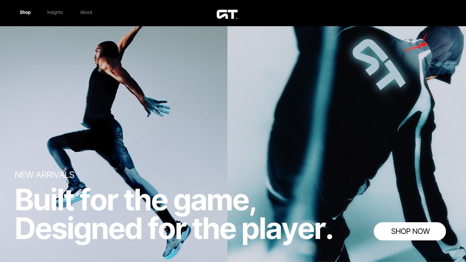
Role
Role
Brand Design
Brand Design
Deliverables
Deliverables
Brand Guidelines
Brand Guidelines
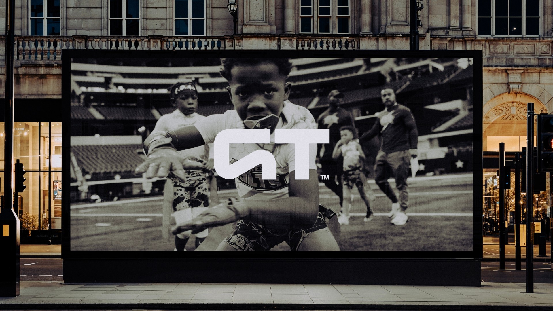
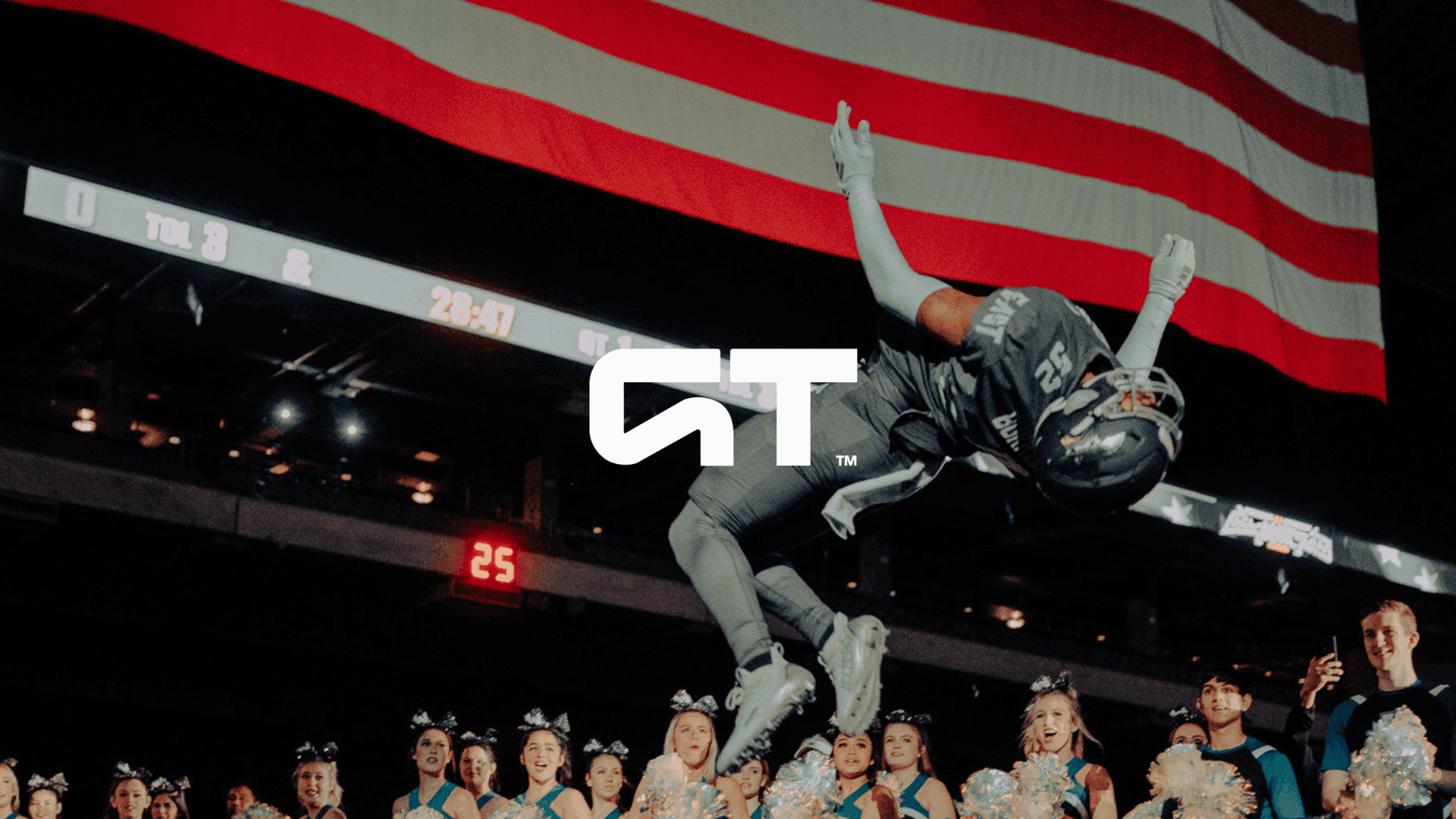
Behind The Logo
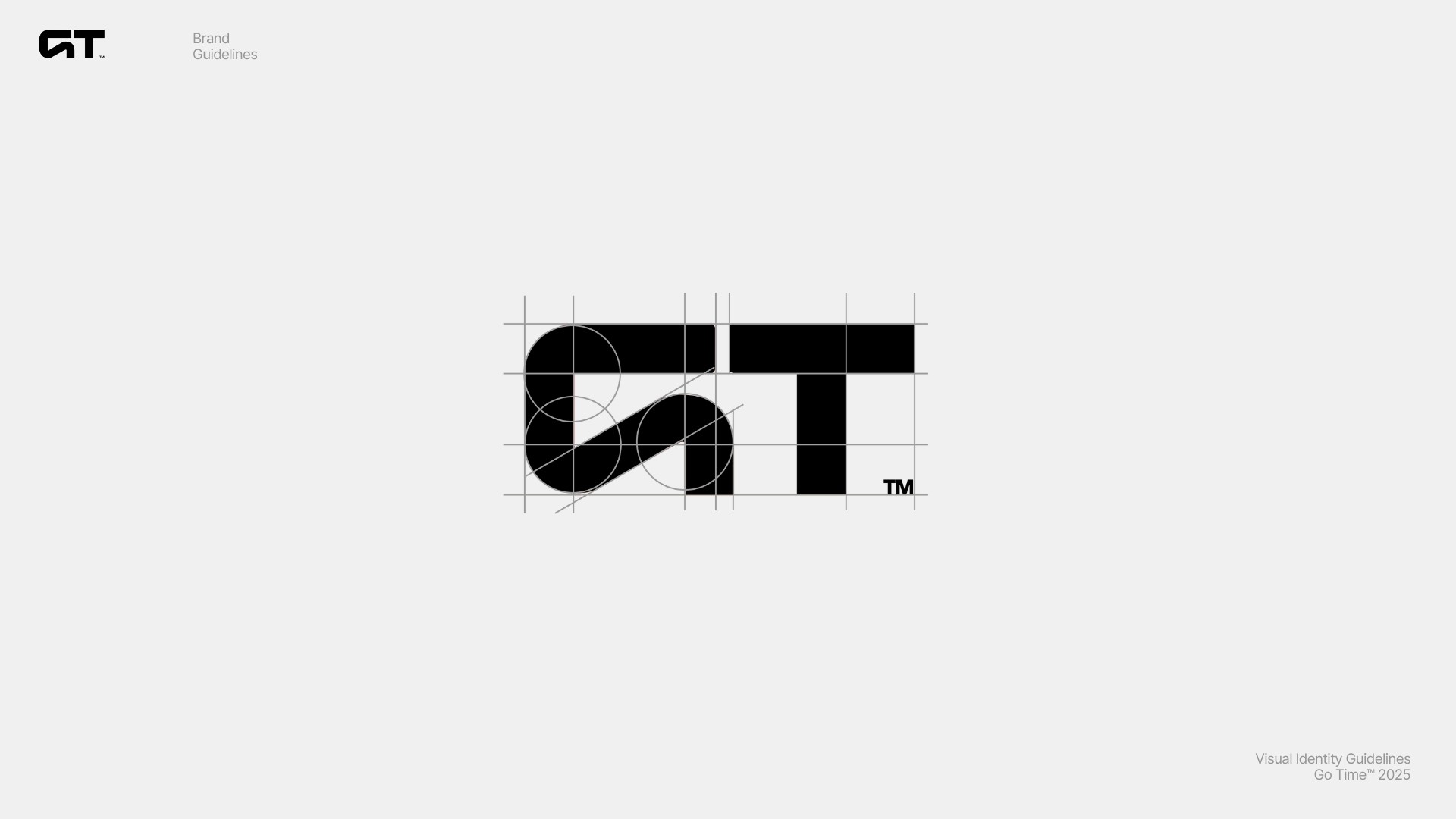
The GT logo is a masterclass in modern design—minimalist yet bold, aesthetic yet functional. At its core is the sleek, curved G, seamlessly merging into the T at the top, creating a symbol of unity and strength.
This deliberate fusion represents the perfect balance between form and function, embodying the seamless connection between athletes and their gear.
The clean, flowing lines of the logo exude confidence and sophistication, while the minimalist approach ensures a timeless appeal. Every curve and edge was designed with intention, reflecting GT’s commitment to precision and innovation.